Creating Pages (with custom layouts)
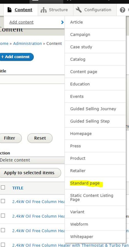
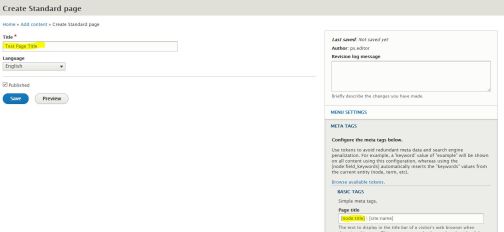
There are a few Content Types that we can select from when creating a new page. Each Content Type server a different purpose and comes with different set of predefined field. For this example we will use a Standard Page content type, which would be suited best for a non PLP/PDP page. Go to Content -> Add content -> Standard page (Fig 1) to open the page creation form.
Basic page data
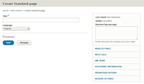
- Provide page title in the compulsory Title field
This title will appear as a page title on the Content list in the backend, as a breadcrumb title and as a search result page title - Select language version of the page from the Language dropdown (or leave as is to use a default language)
- Open Meta Tags tab on the right hand side panel (Fig 3)
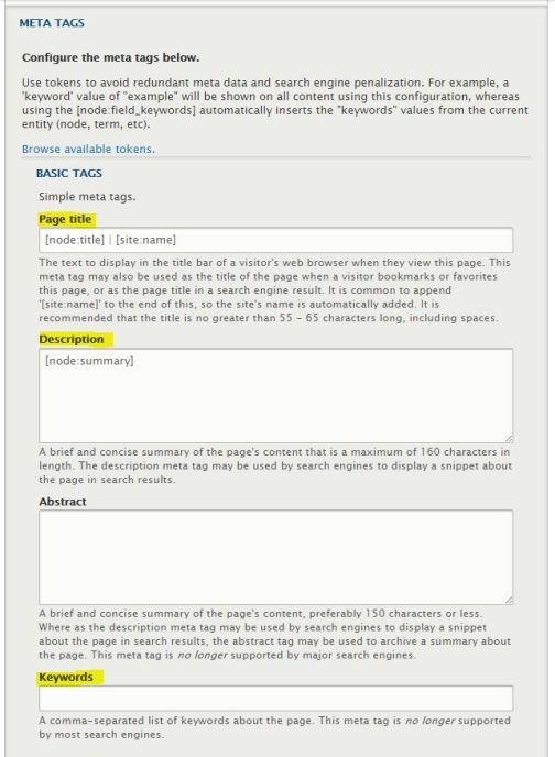
- Page title field is what will appear as a meta title tag in the page header and will be picked up by search engines to be displayed as page title on the search engines' search results page. It will also appear on the internet browser's tab when page is open
- To keep the same meta title as the main page titled entered in the main Title field, leave '[ node:title ] | [ site:name ]' values in the Page title field (Fig 4)
- To make meta title different to the main page title, replace '[ node:title ]' with a title of your choice. Leave '| [ site:name ]' as is - this should not be changed as Drupal will populate site name automatically
- To add custom meta description, replace '[ node:summary ]' with text in Description field
- Enter keywords (if any) into Keywords field
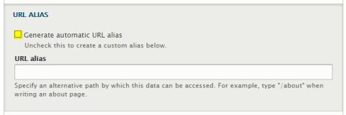
- Open URL (Fig 5)
- To keep URL generated based on the page title, leave 'Generate automatic URL alias' checked
- To provide custom URL alias, uncheck the tickbox and enter custom URL starting with a '/'
- Edit Region Settings, if required - please read more about this setting here
- Check or uncheck the Published tickbox to publish or unpublish page on save
- Save to create the page in the system
Create/Edit Page Layout
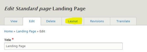
Once page is created, go to edit it's layout. For that, go to Content and reopen the page created in Edit mode (Fig 6) and select Layout tab (Fig 7)

Layout consists of Sections and Blocks. Sections are structural elements that work as containers for content blocks. There are 5 section types available to choose from
- One column
Default website container
- Full width
Full width container, best suitable for Hero Banner and other blocks that would fill entire screen from left to right
- Two column 50/50
Two columns, each takes 50% width of the container
- One Column Narrow
Single column, narrower than default One Column. Best suitable for text content (WYSIWYG block)
- 3/7 Proportion Column
Two columns, left takes 30%, right takes 70% width of the container
To add Section, click + Add Section button (Fig 9) and select a section type from the right hand side panel (Fig 10). Then click blue Add section button (Providing administrative title is optional)


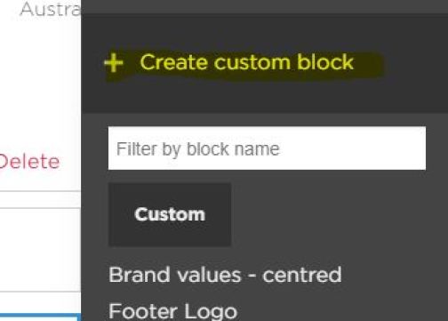
To add a Block into a section, click + Add block (Fig 11) and select + Create custom block in the right hand side panel (Fig 12)
Note: There is an extra list of predefined blocks that would appear below Create custom block button in the panel. These should not be used without consultation. This article covers adding custom blocks only

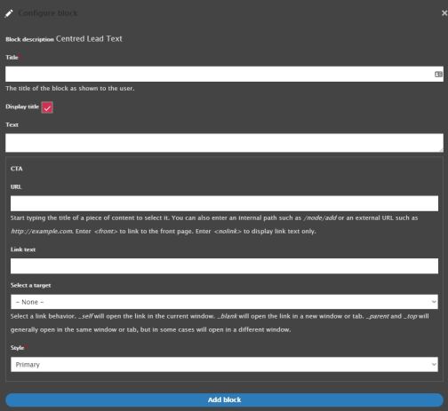
Select block type from the list (Fig 13) to access editing form for given component. Each component is different and consists of different amount and types of fields. Please follow the instructions on the form to complete the editing and, once happy, click Add block (or Update, if editing an existing block) below the form (Fig 14)
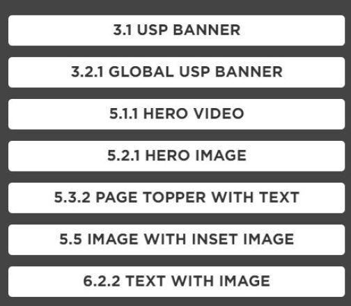
Continue adding blocks and sections. You can add multiple sections of different types and add multiple blocks in each section. Please refer to our Component Library page to review the look and structure of each component.
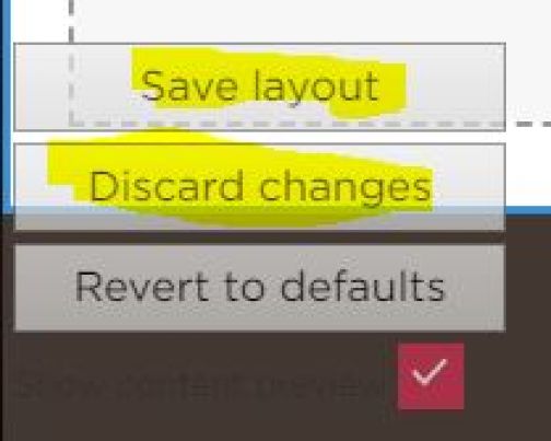
Once happy with the Layout, click Save Layout on the panel in the bottom left corner of the screen (Fig 15).
Alternatively use Discard Changes button to return to last saved version of the page
Editing and moving blocks
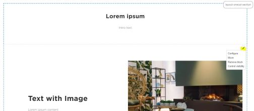
On an existing layout, move mouse to a top right corner of the area of each block to find a Pencil icon (Fig 16). Click it to see available options:
- Configure
Opens editing menu for the block
- Move
Opens panel to move blocks around the page and between sections
- Remove block
Removes block
- Control visibility
Provides ability to set rules for block display
To move block, click Move option from the menu described above. In the right hand side panel (Fig 17) there are two sections:
- Region
Open the dropdown and select a region (section) to which selected block should be moved
- Block label
Click and drag items on the list to move blocks around within the section selected in Region dropdown