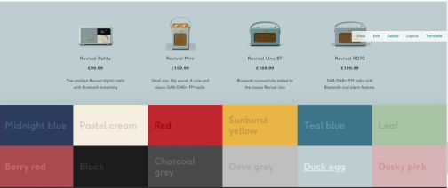
Configure the Colour Picker component
PIM controls all product data including colours so the first thing to do is check that the colour you want to add has been configured in PIM.
Secondly, you will need to navigate to the Colour Swatches taxonomy in Drupal and click 'List Terms'

Find the name of the colour you want to add and click 'Edit'.

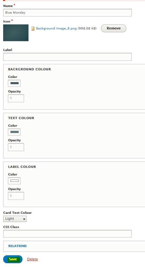
Once inside the Colour Swatch you want to add, you will need to configure the background colour, text colour, label colour and card text colour.
To configure the background colour, you will need to click inside the color box and use the eyedropper to grab the correct RGB from the background PNG. You then need to set the opacity to 1.
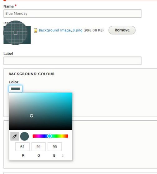
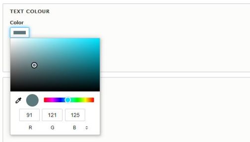
To configure the Text Colour you will need to click inside the color box and set the RGB values to be 30 higher than the respective values in the Background Colour box. In this example the background colour values are as follows: R 61 G 91 B 95 , therefore we need to set the Text Colour values to be R 91 G 121 B 125. You then need to set the opacity to 1.
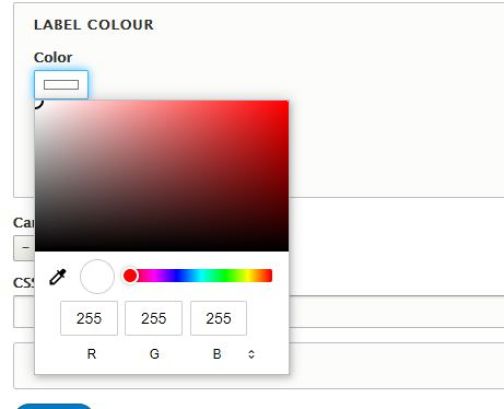
The label colour should be set to white which has a value of R 255 G 255 B 255 and you need to set the opacity to 1.
The Card Text Colour can be set to either 'Light' or 'Dark'.

Then click 'Save'.
Next, you will navigate to the page you want to add the Colour Picker component to and add a new full width section. To that section you will add the Colour Picker component.

Just like the Product Listing component you will select the Product Type and Category that you would like to have included in this section. You will then configure the Colour Picker as shown below, setting the default colour to one of your choice and selecting the available colours you want to include.
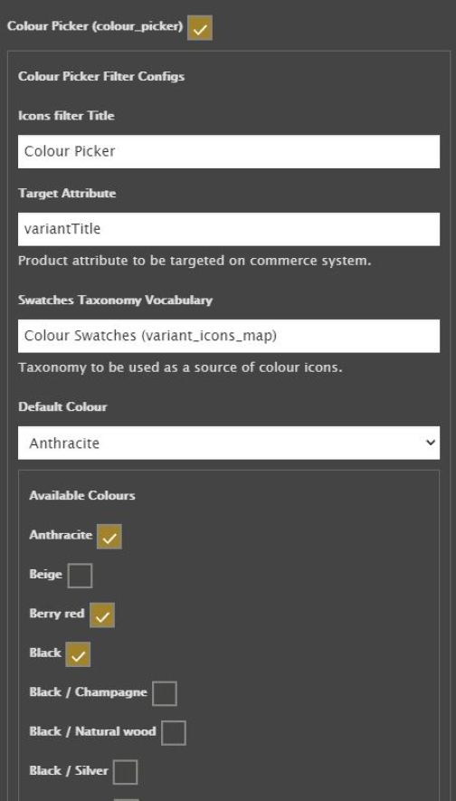
Click 'Add Block' and save the new layout of your page.
You will then see all of the colours that you selected with the default colour underlined and active.
